VG5000 Font

Font Preview
About
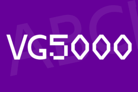
VG5000 by Justin Bihan.
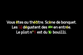
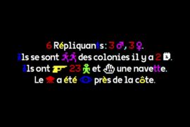
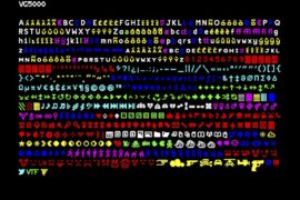
The VG5000 takes its name from the homonymous computer manufactured by Phillips, released in 1984. Its video processor displays bitmap characters built in a common matrix of 8×10 dots. The modern VG5000 is built on a grid 4 times more detailed, allowing more freedom and imagination of curves, where there were only right angles. The superposition of the new drawing onto the starting matrix sometimes reveals unexpected mixtures. Some right angles have been deliberately preserved as vestiges of the first digital fonts, offering a hybrid final shape. One of the inherited features is the accents that are always placed at the same height, forcing some letters to crash. Many glyphs and pictograms complete the VG5000’s original set, including references to VG5000 games and the history of emoji.
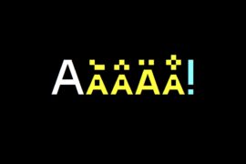
Inclusive characters
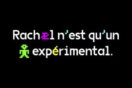
The VG5000 character set contains a sample of experimental glyphs devoted to French inclusive writing, which involves linking the female and male genders in the writing field. These glyphs were imagined on the occasion of the project “On aime pas ça parce qu’on devient deux” initiated by Roxanne Maillet, artist having as a commitment research on the graphic representation of genders in writing: if it is not « il » or « elle » who speaks, it is « iel ». These new characters are built on the same grid as the originals, but they are smaller and combine together in one character.
Examples : ·e : étudiant·e | é·e : né·e | f/ve : veuf·ve | n·e : un·e | s·e : permis·e | u·e : vu·e | ie : iel
Gallery
Tags
Related Fonts

Cagoule DEMO Font
Royal Tomato Font
EPILONION SERIF DEMO Font
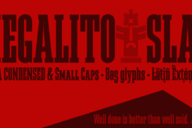
Megalito Slab Font Family