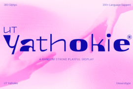
UT Yathokie Trial Font
Font Preview
About
UT Yathokie doesn’t follow rules, because rules are boring. It’s a quirky, unpredictable display font that brings a jolt of personality to whatever it touches. Think techno-pop with a sketchbook soul. This typeface thrives in the space between structure and spontaneity, clean on one edge, full of surprise on the other.
From brand identities to experimental posters, Yathokie is here to turn heads and keep them tilted just a little longer. It plays with rhythm, breaks up patterns, and still lands with clarity.
Target Audience
Graphic designers, art directors, trend-forward brands, creative coders, type nerds, editorial rebels, music labels, visual artistsanyone who loves fonts that don’t behave.
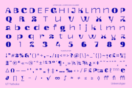
Key Features
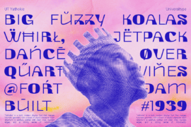
383 carefully drawn glyphs
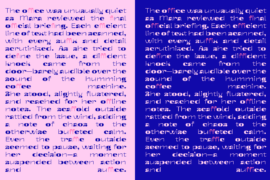
Covers 200+ Latin-based languages
Uppercase, lowercase, numerals, punctuation, symbols
Alternating stroke weights for dynamic texture
Rounded edges, geometric quirks, and experimental joints
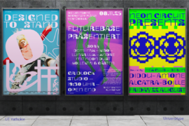
Designed for display use: posters, branding, logotypes, album covers, and motion
Inspiration Behind the Design
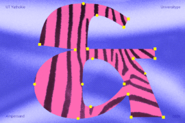
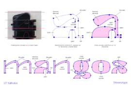
UT Yathokie began as a sparkliterally. The initial idea came from the head of a matchstick: that soft, rounded tip with just enough tension and potential to ignite something bigger. That shapesimple yet loaded with energybecame the seed of this entire typeface.
From there, the design unfolded through playful exploration. The teardrop form from the match head became a motif, echoed across letter terminals, curves, and cuts. It’s present in subtle dips in the lowercase “a,” in the stretched leg of the “k,” and in the looping, unexpected turns of characters like “g” or “y.” The match-head influence morphed into a visual language of its ownsometimes obvious, sometimes buried in the rhythm of the type.
But it didn’t stop with form. Yathokie also channels the vibe of handmade lettering from underground zines, the energy of experimental typography in music culture, and the chaos of trying to design something when you don’t overthink it. It embraces randomnessnot the kind that feels sloppy, but the kind that feels alive. That’s why some strokes feel heavy, others thin. Some letters stretch tall, while others keep compact. It’s a dance between deliberate design and letting the font misbehave just enough.
It’s inspired by contradiction: geometric, yet off-kilter. Friendly, but intense. Structured, but never rigid. UT Yathokie is what happens when you light a match and let the design take the lead.
Usage Suggestions
Eye-catching poster headlines
Bold logotypes for fashion, tech, or music brands
Album art or event graphics that need a strong voice
Editorial layouts that need an expressive twist
Type-led motion or kinetic typography projects
Merchandise that wants to look unconventional
Gallery