TT Artnik Demo Font Family

Font Preview
About
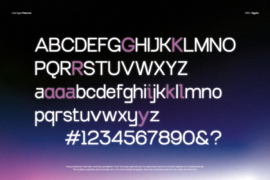
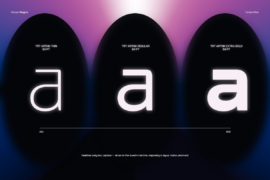
When I began working on TT Artnik, I was reminded of the strength of simple letterforms I had once seen in classic fonts like Futura. That typeface carries a sense of precision, order, and timelessness but I wanted to create a version that felt more flexible and refreshed for today’s design needs.
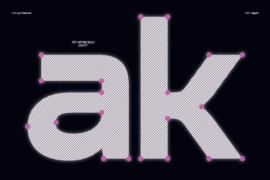
From there, I started shaping the letters using circles and straight lines, keeping the proportions balanced while adding subtle details to certain characters to make them friendlier and more recognizable.
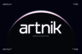
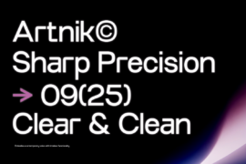
The result is TT Artnik a semi-display sans serif that maintains a geometric structure yet remains versatile for a wide range of projects. From branding and editorial work to digital interfaces, Artnik is designed to be clear, clean, and full of character.
At True Type, we design fonts that are honest, functional
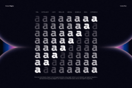
Gallery
Tags
Related Fonts
Geng Rimba Font
Have nothing to do with Font
Elegant Sunrise Font

History Alaska Font