Sugo Pro Trial Font Family
Font Preview
About
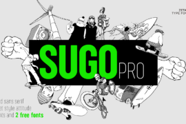
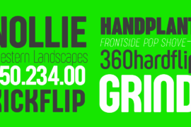
Created as a logo typeface in 2006 by Francesco Canovaro, Sugo is one of Zetafonts oldest and most loved typefaces. A condensed geometric sans with a robust body, slightly rounded corners and no-nonsense street style attitude, it was designed in two weights (regular and extralight) and later modified to create the funky Sugo Funghetto weight, and used by Cosimo Lorenzo Pancini as base inspiration for the design of the successful Cocogoose typeface.
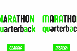
In 2018 the family was completely redesigned by Andrea Tartarelli, expanding the original glyph set to include cyrillic and greek and adding three extra weights and italics to the original two weights. The restored and revamped version, named Sugo Pro Classic, also includes full Open Type features for positional figures, Alternates and Small Caps, and restores alternate glyph shapes created by Canovaro for the original Sugo, accessible as Stylistic Alternates.
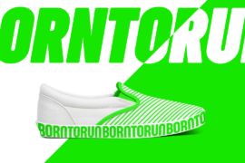
A companion typeface, Sugo Display, uses these alternates as base glyphs and provides a tighter kerning, ideal for display use and logo design. The sturdy, robust design of Sugo makes it an ideal choice for sports branding and street-style editorial use. Lighter weights provide great legibility at small sizes while the regular and bold weights are more suited to titling, logo and headlines. Original styles are included in compatibility packs of matching weights.
Gallery


Tags
Related Fonts
Monogram Handriting Font

SpringWelcomeFont Font

Solidar Font Family
Janethville Font
