Red Hat Font Family

Featured Image Image 1 Image 2 Image 3

Font Preview

Size:
Red Hat Display
The quick brown fox jumps over the lazy dog
Red Hat Display It
The quick brown fox jumps over the lazy dog
Red Hat Display Italic
The quick brown fox jumps over the lazy dog
Red Hat Display Medium
The quick brown fox jumps over the lazy dog
Red Hat Display Medium It
The quick brown fox jumps over the lazy dog
Red Hat Display Medium Italic
The quick brown fox jumps over the lazy dog
Red Hat Display Bold
The quick brown fox jumps over the lazy dog
Red Hat Display Bold It
The quick brown fox jumps over the lazy dog
Red Hat Display Bold Italic
The quick brown fox jumps over the lazy dog
Red Hat Display Black
The quick brown fox jumps over the lazy dog
Red Hat Display Black It
The quick brown fox jumps over the lazy dog
Red Hat Display Black Italic
The quick brown fox jumps over the lazy dog
Red Hat Text
The quick brown fox jumps over the lazy dog
Red Hat Text It
The quick brown fox jumps over the lazy dog
Red Hat Text Italic
The quick brown fox jumps over the lazy dog
Red Hat Text Medium
The quick brown fox jumps over the lazy dog
Red Hat Text Medium It
The quick brown fox jumps over the lazy dog
Red Hat Text Medium Italic
The quick brown fox jumps over the lazy dog
Red Hat Text Bold
The quick brown fox jumps over the lazy dog
Red Hat Text Bold It
The quick brown fox jumps over the lazy dog
Red Hat Text Bold Italic
The quick brown fox jumps over the lazy dog

About

Red Hat is an enterprise software company with an open source development model. We use collaboration and knowledge sharing to craft better, more reliable, and more adaptable technologies. How our words look is as important to our brand voice as the words we choose. That’s why we developed a type family that’s all our own.

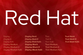
The Red Hat type family is produced in 2 optical sizes, in a range of weights with italics. The fonts were originally commissioned by Paula Scher / Pentagram and designed by Jeremy Mickel / MCKL for the new Red Hat identity.

Red Hat is a fresh take on the geometric sans genre, taking inspiration from a range of American sans serifs including Tempo and Highway Gothic. The Display styles, made for headlines and big statements, are low contrast and spaced tightly, with a large x-height and open counters. The Text styles have a slightly smaller x-height and narrower width for better legibility, are spaced more generously, and have thinned joins for better performance at small sizes. The two families can be used together seamlessly at a range of sizes.

As part of Red Hat’s commitment to open source software, the fonts are made available for use under the SIL Open Font License.

Tags

black body text bold display geometric highway gothic alternative italic large x-height linux low contrast medium regular sans serif tempo alternative tightly spaced

Related Fonts

Latest Fonts