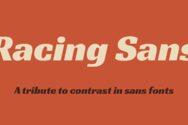
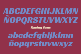
Racing Sans One Font

Font Preview
About
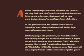
Around 1800 (100 years before Helvetica and Univers) the first Sans Serif typefaces to include lowercase letters used to have very High Contrast (the difference between thick and thin lines). Maybe because the were derived from the more traditional serif typefaces of the time.
But for same reason, as the genre evolved, the fashion was to create ‘monoline’ sans, of very little contrast. Today, contrasted Sans are very rare, and only a few are successful.
While digging in old specimens, we found three that immediately caught our attention: Doric Italic and Taylor Gothic from American Type Founders (1897), and Charter Oak from Keystone Type Foundry of Philadelphia (1906).
Racing Sans is a current high contrast sans, paying tribute to this forgotten genre.
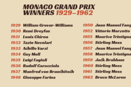
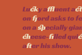
Gallery