Nathan Font Family


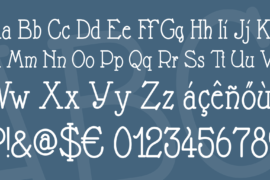
Font Preview
About
Google Translate says:
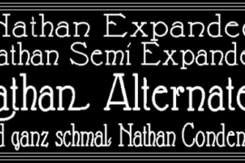
1922: Manfred Noa turns the silent film “Nathan the Wise”. Intertitles explain the plot. At that time, these intertitles were still written by hand with pen and ink. Unfortunately, some of these intertitles are lost and need to be replaced now. For this I have made this font.
The silent film was universally understandable as he did without language and made it clear through actions of the form-fitting actor. The intertitles were with little effort to translate into other languages. As often fragments of silent films from all over the world, the titles must reach the editor also usually be recreated – in German – and also because the original intertitles are no longer available. It should be very close to the originals in the new design, the font and the text panels. Today, in modern even experimental film, is again working with black and white elements and often also without sound. Here, too, the art of the title comes back to advantage. And why should not even shoot a silent film you own – but you write funny intertitles texts – with “Nathan” looks quite original and certainly the “Original”.
Gallery
Tags
Related Fonts

Lokanova Font

AL_CHEVROLA_PersonalUseOnly Font

Roughshark Demo Font
MAHARANI HANDWRITTEN Font