Movement Font Family
Font Preview
About
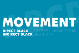
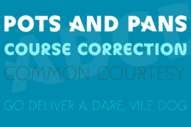
Movement is a display sans that turns the idea of motion into form. Across the gallery and specimen images, it shifts from forceful, blocky uppercase shapes to airy linear versions and softer, more elastic styles, giving the family a distinctly performative rhythm. The “direct” cuts feel taut and structural, with straighter strokes and a disciplined silhouette, while the “indirect” end loosens into curved, flexible lines that feel almost hand-drawn. Even in its heaviest weights, the letters stay wide and stage-like, with a strong horizontal presence that makes the word shapes feel immediate and physical.
What makes Movement compelling is the contrast between precision and gesture. The poster and previews show a family that can move from bold, high-impact headlines to thin, expressive settings without losing its identity. Rounded bowls, simplified caps-only forms, and the visible shift between straight-bound and curved strokes give it a lively cadence rather than a static geometric regularity. According to NM type, the project was inspired by dance movements and developed through collaboration around performer Andile Vellem, with the four extremesDirect Black, Direct Thin, Indirect Black, and Indirect Thinmapping different qualities of weight, space, and time. That makes Movement especially strong for posters, cultural branding, editorial headlines, exhibition graphics, album art, and packaging that needs a sense of energy, experimentation, or contemporary movement.
Gallery
Tags
Related Fonts

Mascefla DEMO VERSION Font Family
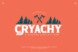
Anarchy Brothers Font
Purslane Font
Mallongia Font