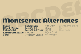
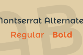
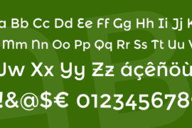
Montserrat Alternates Font Family
Font Preview
About
The old posters and signs in the traditional neighborhood of Buenos Aires called Montserrat inspired me to design a typeface that rescues the beauty of urban typography from the first half of the twentieth century. The goal is to rescue what is in Montserrat and set it free, under a free, libre and open source license, the SIL Open Font License.
As urban development changes this place, it will never return to its original form and loses forever the designs that are so special and unique. To draw the letters, I rely on examples of lettering in the urban space. Each selected example produces its own variants in length, width and height proportions, each adding to the Montserrat family. The old typographies and canopies are irretrievable when they are replaced.
There are other revivals, but those do not stay close to the originals. The letters that inspired this project have work, dedication, care, color, contrast, light and life, day and night! These are the types that make the city look so beautiful.
This is the Alternates family, a sister to the Regular and Subrayada families. Many of the letterforms are special in this family, and ‘Subrayada’ means ‘Underlined’ in Spanish.
Gallery
Tags
Related Fonts
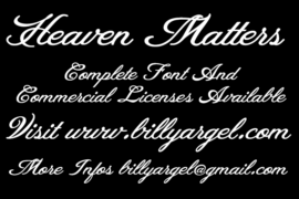
Heaven Matters Personal Use Font
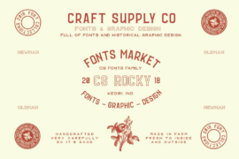
CS Rocky Font
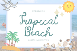
Tropical Beach Font
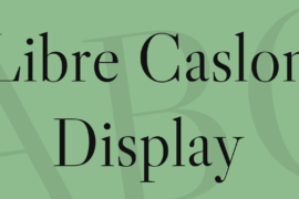
Libre Caslon Display Font