Lato Font Family
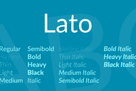


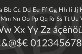
Font Preview
About
Lato is a sans serif typeface family started in the summer of 2010 by Warsaw-based designer Łukasz Dziedzic (“Lato” means “Summer” in Polish). In December 2010 the Lato family was published under the Open Font License by his foundry tyPoland, with support from Google.
In the last ten or so years, during which Łukasz has been designing type, most of his projects were rooted in a particular design task that he needed to solve. With Lato, it was no different. Originally, the family was conceived as a set of corporate fonts for a large client who in the end decided to go in different stylistic direction, so the family became available for a public release.
When working on Lato, Łukasz tried to carefully balance some potentially conflicting priorities. He wanted to create a typeface that would seem quite “transparent” when used in body text but would display some original traits when used in larger sizes. He used classical proportions (particularly visible in the uppercase) to give the letterforms familiar harmony and elegance. At the same time, he created a sleek sans serif look, which makes evident the fact that Lato was designed in 2010 even though it does not follow any current trend.
The semi-rounded details of the letters give Lato a feeling of warmth, while the strong structure provides stability and seriousness. “Male and female, serious but friendly. With the feeling of the Summer,” says Łukasz. Learn more at www.latofonts.com
Gallery
Tags
Related Fonts

Bond Rotterdam Font

Vanessas Valentine Font

Yasmine Script Font

Thunder Demo Font