Josefin Sans Font Family
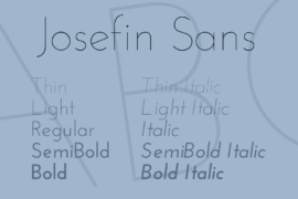
Font Preview
About
The idea for creating this typeface was to make it geometric, elegant and kind of vintage, especially for titling. It is based on Rudolf Koch’s Kabel (1927), Rudolf Wolf’s Memphis (1930),Paul Renner’s Futura (1927).
My idea was to draw something with good style, that reflects Swedish design and their passion for a good lifestyle, and by default all other Scandinavian styles. Something weird happened when I drew the letter “z”: when I took my typography courses in college, I saw a very interesting typeface in a book, the New Universal Typeface “Newut” from André Baldinger (which I have loved since then), and after I finished the “z” I ran into Newut’ site again and noticed that I had unconsciously drawn it with the same haircut.
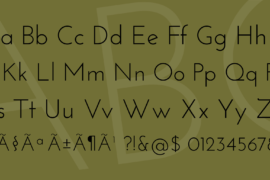
The x-height is half way from baseline to caps height, unlike any other modern typeface.
I wanted to do something different with the ampersand, so I made three and will include them as alternates in future versions. This version also includes Old Style Numerals.
It took me about 1 month to draw 373 glyphs.
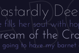
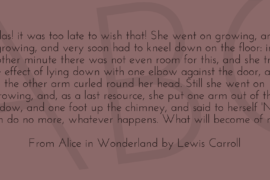
Gallery