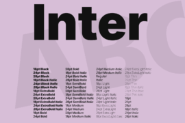
Inter 18pt Black
The quick brown fox jumps over the lazy dog
Inter 24pt Black
The quick brown fox jumps over the lazy dog
Inter 28pt Black
The quick brown fox jumps over the lazy dog
Inter 18pt Black Italic
The quick brown fox jumps over the lazy dog
Inter 24pt Black Italic
The quick brown fox jumps over the lazy dog
Inter 28pt Black Italic
The quick brown fox jumps over the lazy dog
Inter 18pt ExtraBold
The quick brown fox jumps over the lazy dog
Inter 24pt ExtraBold
The quick brown fox jumps over the lazy dog
Inter 28pt ExtraBold
The quick brown fox jumps over the lazy dog
Inter 18pt ExtraBold Italic
The quick brown fox jumps over the lazy dog
Inter 24pt ExtraBold Italic
The quick brown fox jumps over the lazy dog
Inter 28pt ExtraBold Italic
The quick brown fox jumps over the lazy dog
Inter 18pt Bold
The quick brown fox jumps over the lazy dog
Inter 24pt Bold
The quick brown fox jumps over the lazy dog
Inter 28pt Bold
The quick brown fox jumps over the lazy dog
Inter 18pt Bold Italic
The quick brown fox jumps over the lazy dog
Inter 24pt Bold Italic
The quick brown fox jumps over the lazy dog
Inter 28pt Bold Italic
The quick brown fox jumps over the lazy dog
Inter 18pt SemiBold
The quick brown fox jumps over the lazy dog
Inter 24pt SemiBold
The quick brown fox jumps over the lazy dog
Inter 28pt SemiBold
The quick brown fox jumps over the lazy dog
Inter 18pt SemiBold Italic
The quick brown fox jumps over the lazy dog
Inter 24pt SemiBold Italic
The quick brown fox jumps over the lazy dog
Inter 28pt SemiBold Italic
The quick brown fox jumps over the lazy dog
Inter 18pt Medium
The quick brown fox jumps over the lazy dog
Inter 24pt Medium
The quick brown fox jumps over the lazy dog
Inter 28pt Medium
The quick brown fox jumps over the lazy dog
Inter 18pt Medium Italic
The quick brown fox jumps over the lazy dog
Inter 24pt Medium Italic
The quick brown fox jumps over the lazy dog
Inter 28pt Medium Italic
The quick brown fox jumps over the lazy dog
Inter Regular
The quick brown fox jumps over the lazy dog
Inter Italic
The quick brown fox jumps over the lazy dog
Inter 18pt Light
The quick brown fox jumps over the lazy dog
Inter 24pt Light
The quick brown fox jumps over the lazy dog
Inter 28pt Light
The quick brown fox jumps over the lazy dog
Inter 18pt Light Italic
The quick brown fox jumps over the lazy dog
Inter 24pt Light Italic
The quick brown fox jumps over the lazy dog
Inter 28pt Light Italic
The quick brown fox jumps over the lazy dog
Inter 18pt ExtraLight
The quick brown fox jumps over the lazy dog
Inter 24pt ExtraLight
The quick brown fox jumps over the lazy dog
Inter 28pt ExtraLight
The quick brown fox jumps over the lazy dog
Inter 18pt ExtraLight Italic
The quick brown fox jumps over the lazy dog
Inter 24pt ExtraLight Italic
The quick brown fox jumps over the lazy dog
Inter 28pt ExtraLight Italic
The quick brown fox jumps over the lazy dog
Inter 18pt Thin
The quick brown fox jumps over the lazy dog
Inter 24pt Thin
The quick brown fox jumps over the lazy dog
Inter 28pt Thin
The quick brown fox jumps over the lazy dog
Inter 18pt Thin Italic
The quick brown fox jumps over the lazy dog
Inter 24pt Thin Italic
The quick brown fox jumps over the lazy dog
Inter 28pt Thin Italic
The quick brown fox jumps over the lazy dog
Inter 18pt
The quick brown fox jumps over the lazy dog
Inter 24pt
The quick brown fox jumps over the lazy dog
Inter 28pt
The quick brown fox jumps over the lazy dog
Inter 18pt Italic
The quick brown fox jumps over the lazy dog
Inter 24pt Italic
The quick brown fox jumps over the lazy dog
Inter 28pt Italic
The quick brown fox jumps over the lazy dog