Geo Font Family
Font Preview
About
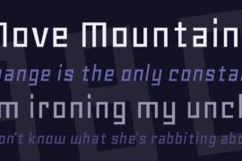
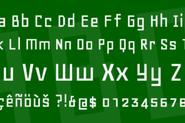
I was shown squared-off lettering on a record label and asked to draw something similar. Geo, the result, was substantially completed within four hours in July 1999. It’s a simple geometric typeface in the mould of some of the experimental faces designed during the 1920s by well-known modernist designers such as Theo van Doesberg and Herbert Bayer.
This style found a strong echo in designs of Neville Brody in the 1980s, which are now identified as an expression of the consumer culture of that decade. During the 1990s the magazine and font catalogue Emigre was at the public front of typeface design, and was a place where computer fonts with this same look appeared.
I think Geo expresses both the directness of some of the 1920s faces and the rather disingenuous consumerist thrust of the 1980s and 1990s descendants of theirs.
Gallery

Tags
Related Fonts
Quilge DEMO VERSION Font Family
Santa Power Font
CS Dayne Demo Font
Planolla Font
