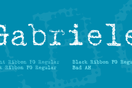
Gabriele Font Family
Font Preview
About
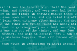
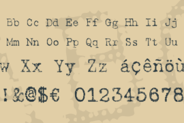
Gabriele was the name of his granddaughter. In 1957 Max Grundig, German industrialist, bought the two companies Triumph and Adler and merged them into his office machine label ‘Triumph Adler’. Thus, ‘Gabriele’ became the name of a popular series of typewriters in postwar Germany.We have chosen this name for our series of typewriter fonts in reminiscence of those machines and all the ladies (called Gabriele or not) that used to type on them from the 1950s to the ’80s.The Ribbon members of the Gabriele are based on the Dave-Rakowski font Harting. You can see the texture of the ribbon in each letter. There is a darker companion font “Gabriele Dark Ribbon FG”. This is a monospaced font. The characters have all the same width – with the exception of the “ellipsis” character (“…”) which is of course three spaces wide. Naturally, these fonts have and need no kerning.
Gallery
Tags
Related Fonts
Mobilize BRK Font
By Note Font
South Gardens Personal Use Font
Rue Font