Eirik Raude Font
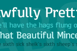
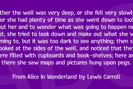
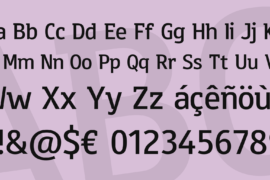
Font Preview
About
Translation of the original German description: Initially I was planning to draw a strong sans serif font. So fresh at work, and I am making very good progress and soon had all the characters together, to put together a preview text. Strange, somehow the font looked quite familiar and reminded me of the work of another type designer. I had to give the font a different character, so I added paint and some serifs, back to making something completely new. No sans serif font no slab serif, not even semiserif. I liked this concept, and I tinkered the letters around a little until I had the feeling they could be presented. Sure, one or the other could still see some action if you wanted to turn it into a professional font, but maybe I’ll do it later in the form of a pro version. Now I needed a name for the font and because my preliminary work was just too reminiscent of a type designer named Erik, I chose a different Erik, namely Erik the Red, the discoverer of Iceland, or in Norwegian Eirik Raude.
Gallery