Children Font Family
Font Preview
About
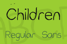
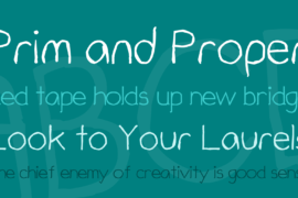
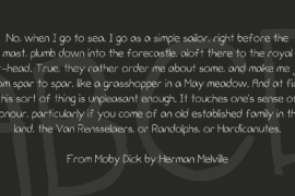
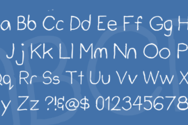
Children & Children Sans are my first fonts that I designed myself. It all started when I discovered a link to a website that turns your handwriting into a font. It took me two tries to make it right. Children was made first and it was very similar to children’s handwriting with unaligned letters. The font itself feels very homey but it lacks legibility. More than a year later, I found a free trial for a Font Editor. I used it to make the glyphs of the font align perfectly to normal font specs. Getting quite the hang of it, I made Children Sans. I cleaned the outlines of Children and made a distinct yet similar font that seems more grown-up than Children.
Five years later, I realized that Children and Children Sans has a very distinct characteristic. The capital “C” has two weird dots above it. It makes the fonts very rough and unfinished. I think it’s part of its charm.
Gallery
Tags
Related Fonts

Syawal Khidmat Font
Classy Free Trial Font
Retro Nakjoy Font Family
Pink Shine Font