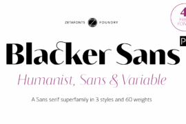
Blacker Sans Display Trial Font Family

Featured Image Image 1 Image 2 Image 3 Image 4 Image 5

Font Preview

Size:
Blacker Sans Display Trial Black
The quick brown fox jumps over the lazy dog
Blacker Sans Display Trial Black Italic
The quick brown fox jumps over the lazy dog
Blacker Sans Display Trial Heavy
The quick brown fox jumps over the lazy dog
Blacker Sans Display Trial Heavy Italic
The quick brown fox jumps over the lazy dog
Blacker Sans Display Trial Extrabold
The quick brown fox jumps over the lazy dog
Blacker Sans Display Trial Extrabold Italic
The quick brown fox jumps over the lazy dog
Blacker Sans Display Trial Bold
The quick brown fox jumps over the lazy dog
Blacker Sans Display Trial Bold Italic
The quick brown fox jumps over the lazy dog
Blacker Sans Display Trial Medium
The quick brown fox jumps over the lazy dog
Blacker Sans Display Trial Medium Italic
The quick brown fox jumps over the lazy dog
Blacker Sans Display Trial Book
The quick brown fox jumps over the lazy dog
Blacker Sans Display Trial Regular
The quick brown fox jumps over the lazy dog
Blacker Sans Display Trial Book Italic
The quick brown fox jumps over the lazy dog
Blacker Sans Display Trial Italic
The quick brown fox jumps over the lazy dog
Blacker Sans Display Trial Light
The quick brown fox jumps over the lazy dog
Blacker Sans Display Trial Light Italic
The quick brown fox jumps over the lazy dog
Blacker Sans Display Trial Extralight
The quick brown fox jumps over the lazy dog
Blacker Sans Display Trial Extralight Italic
The quick brown fox jumps over the lazy dog
Blacker Sans Display Trial Thin
The quick brown fox jumps over the lazy dog
Blacker Sans Display Trial Thin Italic
The quick brown fox jumps over the lazy dog

About

Blacker Sans Pro is a complete redesign and developement of the original family designed by Francesco Canovaro in 2019 as a sans-serif variant of the succesfull Blacker created by Cosimo Lorenzo Pancini and Andrea Tartarelli. The original idea of Blacker Sans was to create a versatile pairing for Blacker, parting with its spiky wedge serifs but keeping its dark, elegant character and extending its weight range to 20 weights including italics.

This Blacker Sans Pro family did also differ in contrast from the original Blacker family, choosing a more even and monolinear, almost grotesque approach. This choice that favored versatility over elegance left some of the original uses of Blacker not covered by its sans counterpart, and so two subfamilies were added, applying to the same skeleton varying degrees of contrast, from the readability-optimized medium contrast of Blacker Sans Text to the extreme variations of Blacker Sans Display, with its elegant juxtapositions of thin curves and thick black slabs.

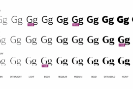
The original signature details of Blacker, like the hook shape of lowercase “f”, have been complemented by new alternate forms, ligatures and swashes, with stylistic sets providing options to easily make logos and headings stand out. The wide range of OpenType features (that includes also small caps, positional numbers, and alternate punctuation) is applied to all the 60 weights of the family, each with over 1600 characters offering language support for 220+ languages using Latin, Cyrillic and Greek alphabets.

Ready to make your text look gorgeous? Ditch your usual sans-serifs and try Blacker Sans Pro!

Commercial licensing is available at zetafonts.com/blacker-sans
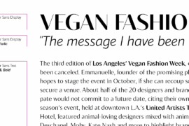
Tags

black blacker superfamily bold display heavy high contrast humanist italic light medium regular sans serif thin

Related Fonts

Latest Fonts