Alien Edifice Font Family

Font Preview
About
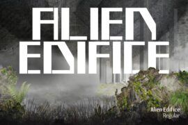
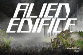
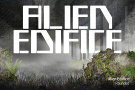
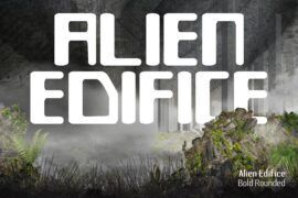
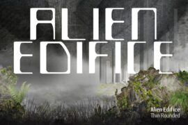
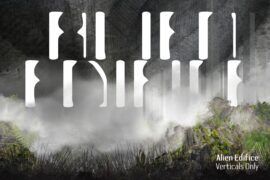
‘Alien Edifice’ is a brutalist headline font that I designed in FontLab Studio 5 over 10 years ago. It was inspired, in part, by the black monolith that appeared at the beginning of the 1968 Stanley Kubrick film ‘2001: A Space Odyssey’. I never released it as I didn’t think anyone would be interested in such a stark, geometric font. I felt it was too imposing, too faceless, dark and menacing, but these days there are many such fonts so I have decided to upload it to see what other designers think of it.
There are so many talented new type designers now whose work really excites and inspires me and who I am in awe of. The font ‘Pilowlava’ by Velvetyne Type Foundry is exquisite! (and available to download on 1001fonts.com). And I love ‘Briar’ font from barrettrm.com. It is so beautiful. ‘Bata’ by Almarkha is fabulous too, very ‘Flintstones’! I adore it!
There are 20 versions of the ‘Alien Edifice’ font in both OTF and TTF, Regular, Italic, Bold, Rounded, and some rather strange ‘experimental’ versions, which look (to me, at least) as if they have condemned and have melted in the sun, with withered or missing stems. These were inspired by H P Lovecraft and are my favourite versions of my ‘Alien Edifice’ font. I enjoy swapping out one or two of the glyphs and replacing them with the melting glyphs from the ‘experimental’ version(s) of ‘Alien Edifice’.
Gallery